Visualizing Butler SOS metrics in New Relic
In this dashboard most of the data comes from Butler SOS, but the failed reload pie chart and table at the top are created using data from the Butler tool.
New Relic does not give you nearly the same level control as Grafana does, for example when it comes to fine-tuning visual details of charts, tables etc.
That can feel a bit limiting at first, but as New Relic’s query language is very powerful and is very well integrated in the chart editor, it’s not really a problem.
A benefit of New Relic’s dashboards is that their dashboard editor very effectively guide you through the creation of charts, using the various kinds of data (metrics, events, logs) you have sent - and are sending - to their database.
New Relic dashboards are thus definitely on the same level as Grafana ditto, which one to use is a matter of preference.
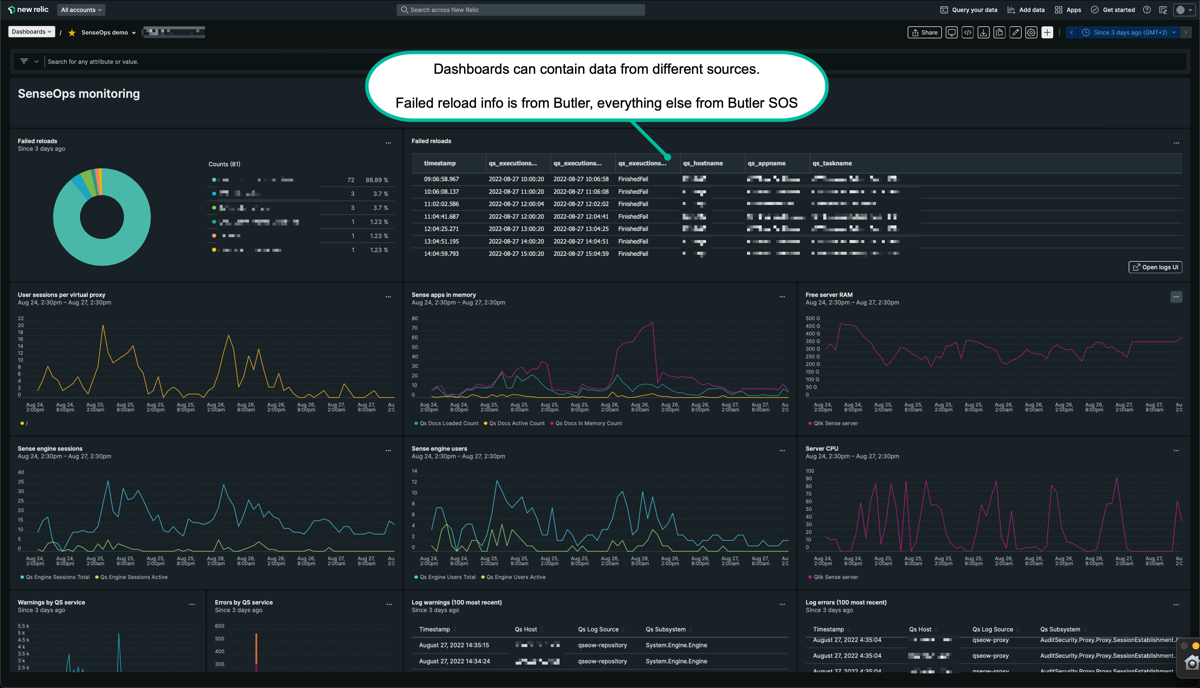
New Relic dashboard with data from both Butler SOS and Butler (part 1).
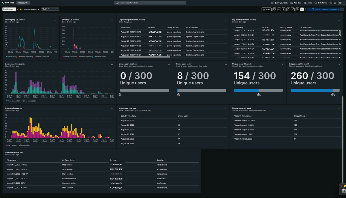
New Relic dashboard with data from both Butler SOS and Butler (part 2).
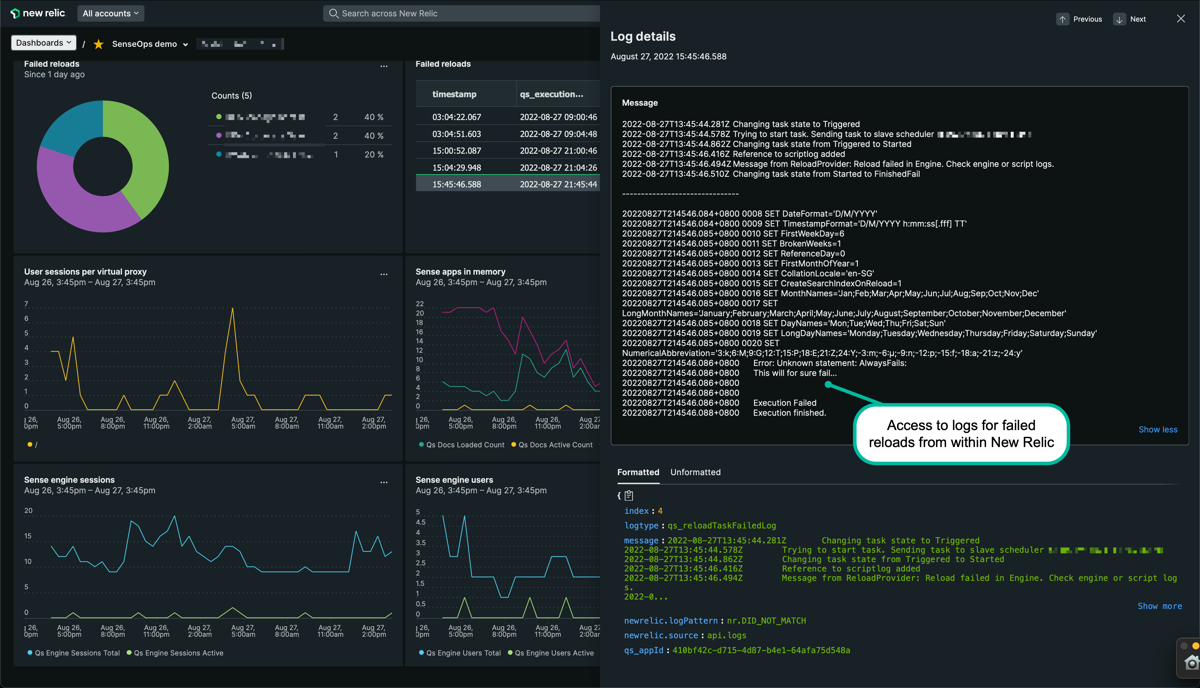
Viewing failed reload logs from within New Relic can save lots of time when investigating incidents.