The whole SenseOps (Butler family of tools, together with support tools like InfluxDB, Prometheus, Grafana etc) stack is really a platform that can be configured and used in lots of different ways.
Be curious and bold - extend the given examples and use cases with your own!
And when doing so - please consider sharing your successes (and failures..) with others, as inspiration and insight.
Tip
You are strongly recommended to use the latest version of Grafana with the latest version of Butler SOS.
That said, earlier Butler SOS versions included some nice demo dashboards too, these are still found below as a source for inspiration what can be done.
1 - Visualising Butler SOS metrics in New Relic
New Relic is a complete SaaS product that offers both data storage and powerful, yet easy to set up and use visualisations.
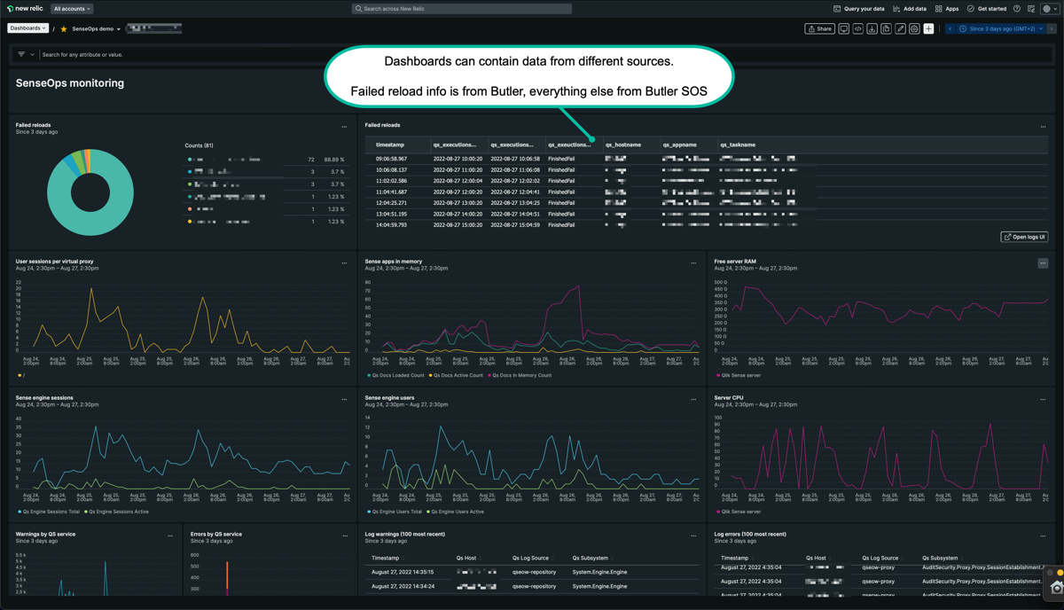
In this dashboard most of the data comes from Butler SOS, but the failed reload pie chart and table at the top are created using data from the Butler tool.
New Relic does not give you nearly the same level control as Grafana does, for example when it comes to fine-tuning visual details of charts, tables etc.
That can feel a bit limiting at first, but as New Relic’s query language is very powerful and is very well integrated in the chart editor, it’s not really a problem.
A benefit of New Relic’s dashboards is that their dashboard editor very effectively guide you through the creation of charts, using the various kinds of data (metrics, events, logs) you have sent - and are sending - to their database.
New Relic dashboards are thus definitely on the same level as Grafana ditto, which one to use is a matter of preference.
New Relic dashboard with data from both Butler SOS and Butler (part 1).
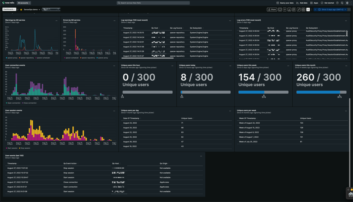
New Relic dashboard with data from both Butler SOS and Butler (part 2).
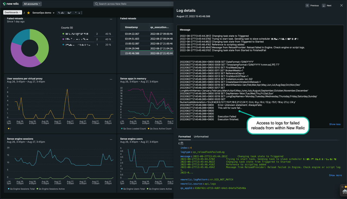
Viewing failed reload logs from within New Relic can save lots of time when investigating incidents.
2 - Qlik Sense monitoring using Butler SOS v9.2 and Grafana v9.1
Grafana 9 adds some interesting features around alerting as well as serveral new and improved chart types.
The visual appearance is quite similar to previous versions, but line charts, tables etc have been replaced with the updated variants that arrived with Grafana 9.
3 - Qlik Sense monitoring using Butler SOS v7 and Grafana v8
With version 8 Grafana further establishes its position as the leadning open source platform for obervability and real-time dashboards.
Butler SOS takes advantage of this, below a sample dashboard is shown.
A concept that has proven useful many times is to use an overview dashboard to monitors high-level metrics for the entire Sense cluster. A separate, parameterised dashboard then drill into the details for each server.
Grafana variables make this both easy to set up, scalable and very powerful.
Sample dashboards are available in the Git repository.
Before importing these to Grafana you should create a Grafana data source called “senseops”, and point it to your InfluxDB database. When you then import the dashboards they should find your database straight away.
Dashboard installation
The dashboard file senseops_v7_0_dashboard.json was created using Butler SOS 7.0 and Grafana 8. It thus usees the new chart, data transformation and alerting features that were introduced in Grafana 8.
Overview metrics
The dashboard has a top section that’s always expanded.
A set of (by default) collapsed sections contain different kinds of metrics and log events.
Top level metrics
Low memory alerts can be set (using Grafana’s alert feature). Such alerts can be sent (using features built into Grafana) as notifications to Slack, Teams, Pager Duty, as email etc.
To keep the dashboard nice and clean it’s usually a good idea to put alert charts in their own section at the bottom, or in a separate dashboard dedicated to alerts.
Apps in memory
From a sysadmin perspective it’s often interesting to know what apps are loaded into memory on each Sense server.
For example, when a server is quickly loosing RAM it’s extremely useful to be able to zoom in to the very minute when the RAM drop occurs, then look at what apps were present in memory. One of those apps is probably not well designed, or is at least using a lot of memory.
The dashboard separates regular apps and session apps.
You can also use Grafana’s standard filtering features to narrow down on the server(s) of interest.
Apps loaded into memory
Users & sessions per server
If things really go wrong wrong in a Qlik Sense Enterprise environment there connected users might be kicked out. It is therefore important to know at any given time how many users are connected, and be able to detect sudden drops in user count.
Another use case could be for maintenance windows: You then want to know how many - and which - users are connected, so you can send them a message that maintenance is about to start.
Users and sessions per server
User events
If Butler SOS has been configured to handle user level events coming from Sense, these are shown here.
You get information about where the event took place and which user has
logged in (started a session)
logged out (stopped a session)
timed out (stopped a session)
opened a connection to a new app
closed a connection to an app (for example closed a browser tab)
… and more
User events
Warnings & Errors
In previous Butler SOS demo dashboards this information came from log db.
Starting with Butler SOS 7 the source of this data is instead the log events introduced in version 7.
Some of this information is also available in the standard Operations Monitor app in Qlik Sense Enterprise, but only in a retrospective way.
Having access to it in close to real time makes it possible to act on developing issues quicker.
Charts provide overview while tables then give the actual messages, as they appear in the log files.
Error and warning charts
Error and warning tables
It’s also possible to drill down into individual warnings and errors to get very detailed information about what happened:
Detailed view into errors and warnings
Butler SOS metrics
Butler SOS is very robust indeed, but it may still be of interest to track its memory use, to make sure there aren’t any memory leaks etc.
Butler SOS memory usage
4 - Qlik Sense monitoring using Grafana 7
Grafana 7 is a big update when it comes to visualisations. Grafana was excellent already in version 6, but with v7 things are taken to a new level.
A concept that has proven useful many times is to use an overview dashboard to monitors high-level metrics for the entire Sense cluster. A separate, parameterised dashboard then drill into the details for each server.
Sample dashboards are available in the Git repository.
Before importing these to Grafana you should create a Grafana data source called “SenseOps”, and point it to your InfluxDB database. When you then import the dashboards they should find your database straight away.
Overview metrics
This view gives high level insights into the 3 virtual proxies (/sales, /sourcing, /finance) in this particlar Sense environment, as well as top-level numbers on users and sessions.
Top level metrics
Low memory alerts can be set (using Grafana’s alert feature). Such alerts can be sent (using features built into Grafana) as notifications to Slack, Teams, Pager Duty, as email etc.
To keep the dashboard nice and clean it’s usually a good idea to put alert charts in their own section (see below for an example).
Apps in memory
From a sysadmin perspective it’s often interesting to know what apps are loaded into memory on each Sense server.
Here you get the details broken down by regular apps and session apps.
You can also use Grafana’s standard filtering features to narrow down on the server(s) of interest.
Apps loaded into memory
Users & sessions per server
If things really go wrong wrong in a Qlik Sense Enterprise environment there connected users might be kicked out. It is therefore important to know at any given time how many users are connected, and be able to detect sudden drops in user count.
Another use case could be for maintenance windows: You then want to know how many - and which - users are connected, so you can send them a message that maintenance is about to start.
Users and sessions per server
Warnings & Errors
This information is available in the standard Operations Monitor app in Qlik Sense Enterprise, but only in a retrospective way.
Having access to it in close to real time makes it possible to act on developing issues quicker.
Charts provide overview while tables then give the actual messages, as they appear in the log files.
Error and warning charts
Error and warning tables
Butler SOS metrics
Butler SOS is very robust indeed, but it may still be of interest to track its memory use, to make sure there aren’t any memory leaks etc.
Butler SOS memory usage
Alerts
While it’s perfectly possible to include alerts in almost any Grafana chart, sometimes its nice to tuck the alert-enabled charts away, out of sight. They will do their job and alert when needed.
Alerts
5 - Qlik Sense monitoring using Grafana 6
Probably the most obvious and common use case for Butler SOS. View Qlik Sense and Windows operational metrics in great looking Grafana dashboards.
Grafana is an increadibly capable tool for showing time series data.
The dashboards shown here are thus just examples and inspiration - feel free to extend and adapt these to meet your particular needs. There are also plenty of sample Grafana dashboards out there to get inspiration from.
If you experience issues with the Grafana dashboards included in the Butler SOS release on Github, you might want to try upgrading to a later/latest Grafana version.
This is a top use case for Butler SOS.
These kind of dashboards give you detailed insights into several important metrics for your Sense servers:
CPU load
Amount of free RAM memory
Number of sessions in total
Success rate of the Qlik engine’s cache
Number of loaded apps in the Qlik engine
A concept that has proven useful many times is to use an overview dashboard to monitors high-level metrics for the entire Sense cluster. A separate, parameterised dashboard then drill into the details for each server.
Sample dashboards are available in the Git repository.
Before importing these to Grafana you should create a Grafana data source called “SenseOps”, and point it to your InfluxDB database. When you then import the dashboards they should find your database straight away.
Overview dashboard
An overview dashboard could look something like this:
RAM usage for each server
Low memory alerts can be set (using Grafana’s alert feature). Such alerts can be sent (using features built into Grafana) as notifications to Slack, Teams, Pager Duty, as email etc.
General/high level user sessions info for both whole system and each server
You can also get very detailed sessions metrics, down to the level of individual sessions per server and virtual proxy.
One possible use case for this information is to see what users will be affected by a pending server reboot. You could even use this information to send a chat message to these users, informing them that their connection to Sense will be lost in x minutes. This feature is not available in Butler SOS out of the box, but is quite possible to implement if needed.
As of Butler SOS v5.0.0, detailed user session metrics stored in a fairly comprehensive way in InfluxDB. The visualisation of these metrics is still kind of rough though. The charts below can serve as inspiration, but can surely be improved upon..
Detailed user sessions info per server and virtual proxy
When something breaks in a Qlik Sense environment the logs immediately fill up with warning and/or error messages. By keeping track of these it’s easy to quickly spot (and get notified) issues when they first occur:
Detailed user sessions info per server and virtual proxy
Note how there are lots of INFO level messages generated (note the y axis scales in the diagram above!).
In a production setting it’s usually a good idea to turn off extraction of INFO level log messages into InfluxDB.
 Top level metrics
 Apps loaded into memory
 Users and sessions per server
 User events
 Error and warning charts
 Error and warning tables
 Detailed view into errors and warnings
 Butler SOS memory usage
 Top level metrics
 Apps loaded into memory
 Users and sessions per server
 Error and warning charts
 Error and warning tables
 Butler SOS memory usage
 Alerts
 RAM usage for each server
 General/high level user sessions info for both whole system and each server
 Detailed user sessions info per server and virtual proxy
 Detailed user sessions info per server and virtual proxy